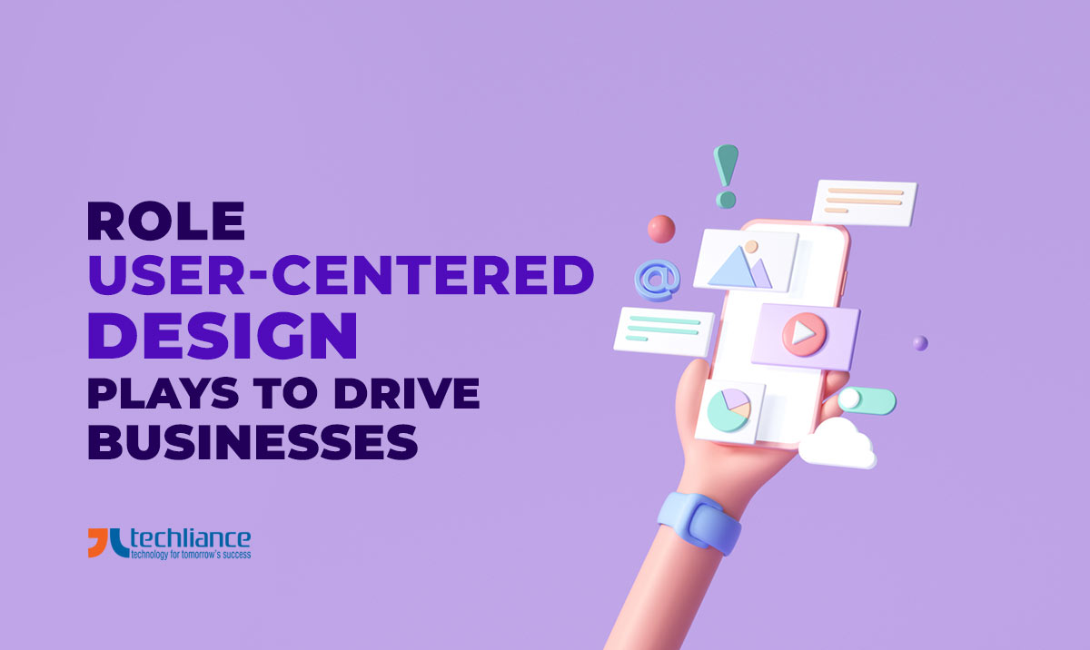
This is 2026 and it’s all about giving users choices. You want products or services that add value to the daily lives of consumers. When it comes to design themes nowadays, dark mode is one of the prominent UI structures.
Web-centric solutions and mobile apps are driven by users and their “urgesâ€. The concept of usability has become a norm globally and in the United States. So, the businesses that ignore this idea can say goodbye to their chances of getting successful.
Customers want style, and elegance in the products that they use. That’s why dark mode is becoming the “must-have†feature in websites and mobile apps. So, its usage in web designing and development will keep increasing in the years to come.
Progression in the design landscape
Let’s rewind to the 1990s when dial-up internet and static websites were the only way to communicate with customers. There were very few search engines. And Google was something that was just unveiling itself. This was the time when the website and design aesthetics were not that great.
In some cases, these esthetics were even shameful. Nobody was anxious about what the website should look like. Most websites were unappealing and no standards were certainly in use.
Then came a time when websites became such a viable source of business and everyone sought a responsive minimal look. Now, websites and even mobile apps have different choices of themes for better viewability. The light and dark theme options give users the discretion in selecting the way they want to view the content.
What is the dark mode?
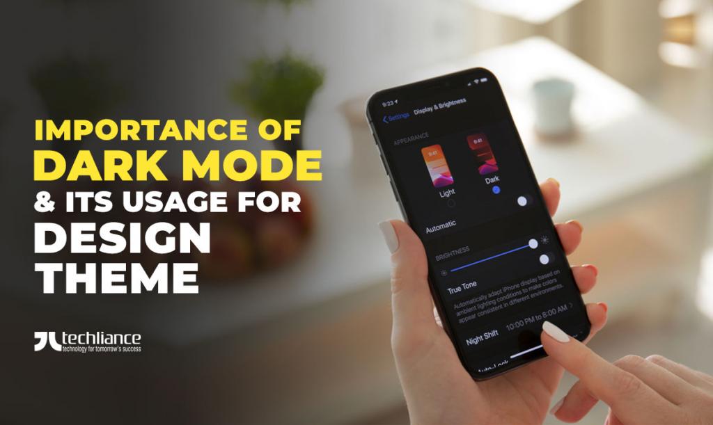
The dark theme or dark mode is a color arrangement in web design and user interface design. It makes use of bright-colored text, icons, and other graphical elements on a dim background. This light-on-dark color scheme is also known as dark UI, night mode, theater mode, or cinema mode.

Why go for dark mode at all?
Dark UI has turned out to be an essential factor and now everyone is doing it. This has become something that you would automatically want for your website or mobile app.
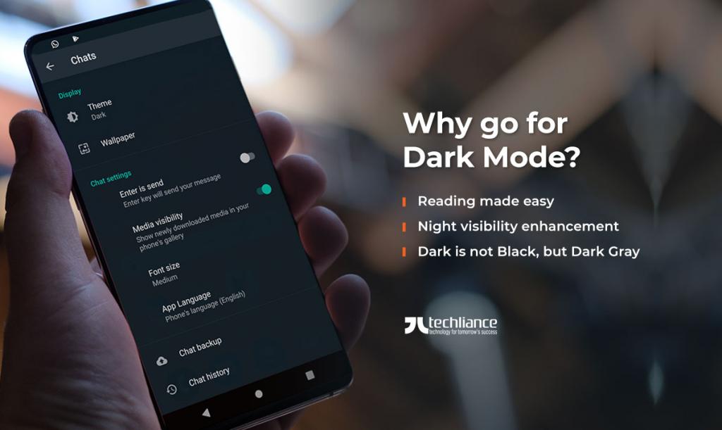
So, the dark mode can help you in many ways.
- Reading made easy
- Night visibility enhancement
- Dark is not black, but dark gray
We now explore these aspects of the dark theme briefly.
Reading made easy
Some people have reading issues and this mode can help them read words better. Although this is not a scientific fact, it does help in a way to enhance their visibility. There are a lot of visually impaired people around the world and in the USA.
Currently, everything is going online whether it is a product or service. So, you want to make sure that the content has better readability for its intended audience. That’s why dark mode can help your users even in dimly lit environments.
Night visibility enhancement
A lot of people consider this as incognito or night mode, where even keypads or displays get in darker shades. Especially, this improves their visibility when there is no other light but from the mobile or monitor itself. People like to use PCs and smartphones at the night, so the usage of the dark theme is increasing.
Dark is not black, but dark gray
When it comes to style, black has always held its prominence. It adds a certain substance and element of elegance to the design front. A lot of images can look powerful, and so does the light-on-dark color arrangement is helpful.
When a lighter font on a darker background is used, the effect is powerful and helps draw attention. Also, it automatically brings attention to the content. Particularly, when the majority of products are showcased on a white background.
In essence, it is a dark gray color, that is utilized as background in dark mode. After all, by creativity in design, you are not going to make a black hole. That too in the name of innovative ideas like a website or mobile app.
Knowing what to do with a dark UI
As a business, you must decide to include both modes for your theme. Because it is important to understand that both theme and dark theme have their separate uses. So, you need to understand that the color scheme for buttons, fonts, images, etc. is different for both themes.
You can’t use the same colors in the design arrangement for the light and dark themes. A lot of companies make this crucial mistake which implies that the purpose of having dark mode is completely lost. Similarly, adding shadows to elements in the dark theme is a big no.
Realize that both iOS and Android platforms have different visualization aspects that you need to take care of. It is best to know that you’ve to pleasantly surprise users with the additions or subtractions in either design mode. Do not let the design themes be destructive to the liking of users.
Nevertheless, You do not want to shock them. Because that would mean an instant switch off from the website or the mobile application. For this reason, it is always best to test the dark UI.
Get expert advice by hiring quality assurance staff who will test the theme(s). They can give you viable and valuable advice. Your designers must pay heed to this information while laying out the design.
Conclusion
As time advances, every business is moving towards giving more options to users, when it involves web and UI design. These options not only focus on what consumers can buy, but also enrich the medium for the purchase. Design is not just what meets the eye but also the purpose it serves regarding its appeal, aesthetics, and likability.
In the digital era, trends in website design and user interface design are witnessing a constant transformation. Presently, companies focus on customer-centric design from the moment business requirements are taken. The emphasis is on increasing user attention and ultimately building up higher user retention.
With the inclusion of dark mode, you are furthering your interaction and conversion chances. The majority of web-driven and mobile solutions offer this mode to users as an add-on. So, the users are happy with choices on the kind of visual display for the product.
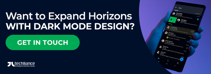
Are you looking to expand your horizons with dark mode design? Why not go for expert-level advice from Techliance to help you get what you need? Contact us today for perfect design and development services with a 1-week trial.
FAQs about dark mode
The dark mode is a supplemental design theme that you can use to display mostly dark surfaces on the UI. Also known as the dark theme, it reduces the light emitting from device screens. This design theme maintains the minimum color contrast ratios essential for readability.
A dark theme uses dark gray, rather than black, as the primary surface color for components. Dark gray surfaces are better for dark mode, as they can express a wider range of color, elevation, and depth. Also, it is easier to see shadows on a darker gray background (instead of a black backdrop).
Light mode (dark text and UI elements on white background) is the best in terms of readability. Whereas, dark mode (light text and UI elements on dark background) is better for reducing eye strain in low light. With the majority of the screen dark, dark mode decreases the screen glare. Therefore, it minimizes flickering and blue light.


[…] dark mode is also preferred by users with visual impairment. So, it has its user base which makes it a […]
[…] Trending: Dark Mode is chick […]
[…] uncomfortable for you, move on to other ones. For instance, take the recommendation to go to a black and white screen. If you work at night, that idea won’t work well for your […]