In today’s modern world, companies want to remain up-to-date on various trends of capturing the attention of customers. Users are no longer interested in businesses that cannot be accessed through their mobile phones. So, a mobile-friendly website has become the need of the day during 2023.

Without it, your business is likely to be overlooked and soon forgotten. As part of web development solutions, creating a mobile-friendly website is something that needs to be catered for. After-all user-friendliness is the gold standard for websites in the mobile/digital era.

There is a requirement for being readily available for quick access, a follow-up, or just random browsing of products. These are some of the necessary functions that companies want their websites to perform without any flaws or issues. In essence, company websites are like the doors to their existing businesses.

They help users understand what the company is all about which in turn shapes the overall impression of the brand. Most people do browsing through mobile phones now. So, it is an essential element for your website to have the mobile-friendliness characteristic.

Benefits of mobile-friendly websites in the digital world

What is a mobile-friendly website?

In a nutshell, a mobile-friendly website is a website that looks perfect when you open it on your mobile phone. To further elaborate, such a website is responsive. This means it can be opened on any kind of screen resolution: mobile phone, tablet, etc.

Companies today want holistic websites that serve multiple purposes. Thanks to the evolution of the web programming process, a website is not like a plain Jane anymore within 2023. Rather, websites have a lot of elements like mobile friendliness that help in capturing a wider segment of the audience.

In case, your website is unpleasant to navigate on mobile, then visitors will leave it. That too possibly with a lower opinion of your brand and less likely to convert. On the other hand, a slick and polished mobile experience can help you build your brand’s credibility.

What is a mobile-friendly website?

Why mobile optimization is important for a website?

Nowadays, organic visitors are very impatient. They have internet access; can receive any kind of content they want on-demand and not wait long to get it. More than half of all web users expect pages to load in under two seconds.

By the three-second mark, most mobile users are likely to navigate away from your slow website. Yes, your website may load fast enough on a desktop computer with Wi-Fi. But it will take much longer on a phone connecting over a cell network.

Low website usability can also push users away and lower the opinion of your brand. Mobile-friendliness is increasingly turning into a standard these days. In essence, employees are starting to expect mobile access to work systems from their employers.

This means that your efforts at securing organic traffic may go to waste. Moreover, there are serious costs beyond your placement in the search results. Bing, Yahoo, and other search engines also give preference to a mobile-optimized website over non-mobile-friendly websites in the search results.

A well-designed mobile experience will also lend you a strategic advantage over competitors who do not have a mobile-optimized website. Therefore, the web programming procedure now emphasizes measures to make sure that the built website is mobile responsive.

We spend more time than ever browsing the web on our mobile phones. The share of global web traffic from mobile has grown from 31.16% in Q1 2015 to 59.16% in Q4 2022. Whereas, the American people spent an average of 4 hours and 21 minutes on their mobile phones daily in 2022.

More reading: Comparison of mobile-first design and responsive design for businesses

Features of mobile-friendly websites

Here are some aspects that show that mobile friendly website is the need of the hour through 2023.

  • Responsiveness because aesthetics matter
  • Flawless mobile-first experience
  • Allowing room for order management
  • Smooth payment management
  • Prelude to a mobile app
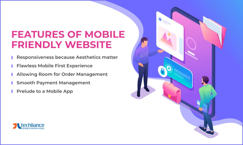
Features of Mobile Friendly Website

Let’s explore in detail these factors that are important for making a website more mobile-friendly.

Responsiveness because aesthetics matter

A mobile-friendly website looks the same on mobile devices, as it’ll when you open it on a typical desktop browser. All thanks to responsiveness, its alignment will not be distorted with things out of place. The website will still have all the buttons, text, and images within the defined placeholders.

Flawless mobile-first experience

Nowadays, users expect websites to work flawlessly on their mobile phones. It means that the navigation and user flows must be working without any problems or delays. This calls for thorough testing of the website on mobile devices to check whether they can work without any issues.

Sometimes, a normal user flow works correctly on a desktop browser. However, it may have a breakage point on a mobile device. Use separate test cases to analyze all the business flows. This ensures that the buttons, navigation, and various action points of the website are properly operating on mobile devices.

Allowing room for order management

One of the best methods of converting potential customers is to empower them to browse product catalogs with mobile devices. Thus, it can be a tricky part as you need to have proper thumbnails of the product items with prices. Tapping on any product should allow it to be expanded for a bigger view.

You also need to have a search box and a sidebar with all the categories available for users to tap on. This way, they can navigate to the respective category and desired products as per their liking. All this needs to be managed efficiently within the website window, which is on a tiny mobile device screen.

At times, it can turn out difficult to execute. Nevertheless, if done correctly, you’re likely to have a user purchase an item right from the website there and then. This feature will make your website a mobile-ready website.

Smooth payment management

The incorporation of easy payment management is very important to implement. As it is the crucial element for ensuring sales in the system. The seamless integration of a payment gateway enables users to successfully check out after inserting items into their carts.

Here is a good tactic to gauge the mobile-friendliness of your website. Assess it as a first-time user who would be checking out their items. So, here is the scenario to go through.

You have to test how easily a user can add a payment method and then use it for making the purchase. Just in case, this scenario properly runs through a mobile device. Then, it means that the website is a pass.

Prelude to a mobile app

A mobile-friendly website and a web app are precursors to a mobile app. Once, users have gone through the website, checked the product catalog, and made a purchase. It means that they are hooked on the company’s business.

Therefore, they are far more likely to use it further and even go on to download the mobile app. This is the main objective of your website. It would be served once the user downloads the app on their phone.

To go that far, you need the website to adhere to many factors. At least implement the mentioned elements. The bottom line is your website needs to work in a top-notch condition on mobile devices.

Why do you need a mobile-optimized website?

On average, more than half of your visitors are browsing your website with a smartphone. So, a mobile-optimized website is a key to success in 2023. If you don’t improve your website for mobile, you are turning off a significant chunk of your brand’s prospective customers.

You need to optimize your website for mobile if you want to capture the most conversions possible. Future-focused IT firms provide user-friendly website development solutions that deliver a perfect mobile-first experience to consumers. Because more users search on cellphones than desktops, Google prioritizes mobile-optimal sites in its search results.

Now, we will discuss techniques for testing the mobile-friendliness of your website. We will also briefly consider ways of optimizing your website for mobile phones. If your website is not mobile responsive, Google will push it down the search results page.

Why do you need a mobile-optimized website?

Ways for checking the mobile-friendliness of your website

With the right techniques, you can cut back on load times and improve your website’s mobile aesthetics. Mobile-ready testing tools, like Google’s PageSpeed Insights tool, allow you to test the optimization of your website by URL. It generates a screenshot of how your site appears on most mobile devices.

Also, it provides a list of any common mobile usability problems your website may have. These issues include overly small font sizes, not optimized images, or the use of Flash. The latter is no longer supported by Adobe and will not run on most mobile devices.

Likewise, you want to check how fast your site loads as well. Most analytics platforms, including Google Analytics, offer tools that let you check how quickly your website opens on average. These tools also typically break out what exactly is contributing to your load time.

Occasionally, website slowness does not happen due to the website’s design. Communication with your web hosting partner’s server may turn out the culprit. This is a problem that you can fix by switching hosts or upgrading your service.

Now legacy Google’s test my site speed checker even permitted to check issues by pasting in your site’s code. Also, there are third-party tools available online to diagnose mobile-friendliness errors for a URL. You can take advantage of them to help in reporting many issues of such kind.

Decision time: Website or mobile application or both

The main approaches to mobile-optimized web design

Once, you are done with the identification of the main problems. Then, you can start working on optimizing your website for mobile. There are three major approaches to mobile-centric web design.

  • Responsive Design: Layout your website with content and structure that changes based on what kind of device a visitor is using.
  • Dynamic Serving: Create a parallel, mobile-specific version of your website and serve these web pages to visitors using mobile phones.
  • Parallel URLs: It is just like dynamic serving, but you create a parallel set of URLs and steer mobile users to these web pages.

Of these three options, “responsive design” is the easiest to implement. Also, it is the cheapest to maintain in the long run. Accordingly, it is the most preferable mobile optimization strategy for most website designers and web developers.

With the approach of responsive design, you want all the different elements of your site’s design. Whether they are sidebars, contact info forms, or blog posts — to scale or respond based on user input. Your mobile website is as content-complete as your desktop version, but with content that is mobile-ready.

The major perspectives for mobile-optimized website design

Some tactics for optimizing your website for mobile

Dynamically compress large images and scale up text so that it is easy to read on mobile devices. Good website design is about ensuring your website is attention-grabbing on all types of devices. Also, keep your website as easy to navigatable on cell phones as it is on desktops.

Some mobile design best practices require basic web developer knowledge. You will want to minimize your website’s HTML, CSS, and HTML. Avoid render-blocking your CSS and JavaScript in above-the-fold content.

Instead, make inline calls to functions as per requirement. Keep the navigation bars and menus short. Make it easy to navigate to the important pages, especially the homepage, no matter where users are on your website.

Divide your CSS and JavaScript into smaller files. Furthermore, defer the JavaScript and CSS code that you are not using before the page load. So, your website is not trying to load your CSS and JavaScript before opening page content.

Optimize the forms for mobile keyboards, which can be harder to use than the desktop versions. For example, you can enable users to input the date with a calendar popup. Rather than limiting users to doing so through manual entry.

Tip: Getting success with web applications for businesses

Testing your new mobile-friendly web design

Once you settle on a draft design for your website’s mobile version, you should test its usability. That’s where Google’s mobile-friendliness tool comes in handy. Also, many 3rd party tools provide you with feedback from the site testers.

The resulting information includes other useful UX info, like videos of user sessions, depending on which device you use. These videos give you an idea of how people navigate your website and any elements that are a little awkward. Some estimates show that mobile usage is likely to grow in the coming years.

Getting your website mobile-ready may take a few iterations. But the benefits will almost certainly make up for the costs. Consequently, you can gain more visitors and increase brand credibility from a refined mobile experience.

Need an under budget Mobile Friendly Website

Conclusion

Many businesses test the waters through a website first, to expand their client base and increase sales. This calls for serious planning, analysis, and execution for creating mobile-friendly websites. Nonetheless, such websites that run as a charm on mobile devices are helpful for users on various levels.

By having a mobile-responsive website, you are allowing users to explore your products and services. That too without them having the hassle of exclusively downloading a mobile app. Also, it helps you save a lot of money and time in building mobile apps for different platforms.

Do you want to develop a website that is mobile-friendly? At the same time, you want to keep this project under your budget. then contact Techliance today for evaluating your possibilities.

Remember, effective website design will only become more important over time. This growth also means the strategic advantage of mobile websites will become even more valuable. A mobile-responsive website helps you better market your products and drive conversions.

Whether you are crafting a new website, or want to re-design your existing website. Facilitating customers with a mobile-first experience for users is necessary now and for future years. It is never too late to begin the journey for a mobile responsive website.

Are you on the lookout for a mobile-optimized website? Techliance is here to help with all of your website creation and modification needs. Let’s start on your website project with a 1-week free trial.

Do you desire a mobile-optimized website?

FAQs about mobile-friendly websites

Here are answers to some frequently asked questions (FAQs) about mobile-friendly websites.

Why should my website be mobile-friendly?

A mobile-friendly design makes a website more available. Mobile users get to the web at whatever point they need, wherever they are. You know the fundamental reason they peruse the web from their mobile devices. The moment requires it and a desktop PC or laptop is unavailable.

Is mobile friendly website important?

A mobile-friendly website helps you build credibility with your customers, clients, and influencers in your industry. With it, users visiting your website on a mobile device get a proper experience. This encourages them to see you as a credible resource for information, products, and services.

How do I make my website look good on mobile?

A website feels attractive on mobile devices, if it is responsive, has large font sizes, and includes large buttons. Decrease the page load time, avoid using Flash, and reduce the size of images. Intelligently present information that people are searching for.

Use the viewport meta tag. Compress source code including CSS and JavaScript. Test the performance of the website on popular mobile phones and tablets.
 
In case, you choose to build a mobile website instead of a responsive website. Then, permit users to switch to desktop view. Simple features like turning off autocorrect can also improve user experience.

About the author