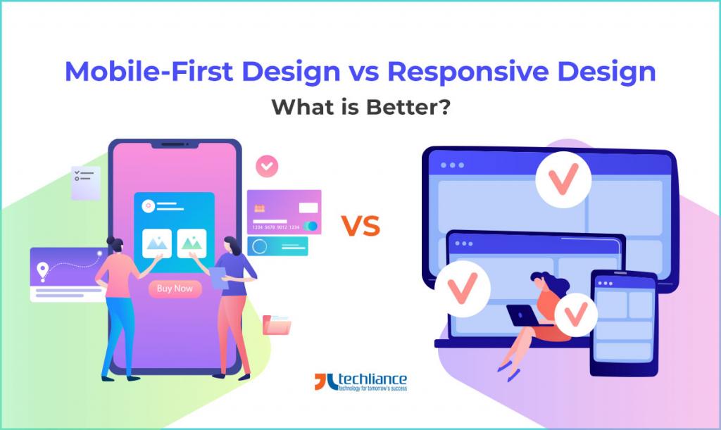
Design is the layout on which you build a website. Many types of design are prevailing globally and in the United States. Responsive design and mobile-first design are two important kinds of design. A comparison like mobile-first design vs responsive design plays a role in deciding the website design approach during 2026.
A mobile-first design is significantly different from a responsive design. Though, in several instances, these two concepts are used interchangeably. This shouldn’t be the case because each one has distinct characteristics. However, both concepts are used in the UI/UX design of websites.
Search engines like Google value smartphones and mobile users. It is evident from Google’s decision to apply mobile-first indexing when ranking websites. Mobile-first indexing means Google will check the mobile site first and then use it to rank the desktop website.
Relevant Internet and Mobile Usage Stats
Consider these numbers and facts.
- By October 2020, over 5.20 billion people (67% of the world population) are unique mobile users.
- As of October 2020, almost 60% of the global population (4.66 billion) uses the internet to stay connected.
- Additionally, more than 4.32 billion people access the internet through their mobile devices.
- In 2020, approximately 1/2 of the global internet traffic involved smartphone users.
- Google also states that most shoppers now prefer to shop using their mobile devices. People favoring in-store shopping also search on mobile phones before going out to purchase.
First-of-all, these questions are important. What is the meaning of mobile-first web design? Why is a responsive website design vital? Which approach drives the best results?
The only way to find the answers to these questions is to understand each approach. So, a thorough deliberation like mobile-first design vs responsive design is necessary. Remember both concepts focus on providing a convenient user experience, thereby drawing more visitors.
What is Mobile-First Design?
In 2010, smartphones were slowly becoming increasingly popular worldwide. Then, Google CEO Eric Schmidt came up with the idea of adopting the mobile-first method when designing or building products.
Mobile-first design is a design strategy where the product prototype is built first to cater to the smallest screen. Developers and designers create websites for mobile devices first and then for devices with larger screens. For example, personal computers, laptops, and tablets.
Mobile-first design follows the progressive advancement principle. This means designing a product with the most complex or most challenging device in mind first. As such, essential elements, features, and functions are designed according to the needs of the small-screen device (i.e., smartphone). So, the users will have an appropriate and satisfying UX experience amid 2026.
Then the designer puts in additional features, this time focusing on devices with larger screens. This version is more complicated, advanced, and interactive. It is vital for sufficient user experience on PCs, laptops, and tablets.
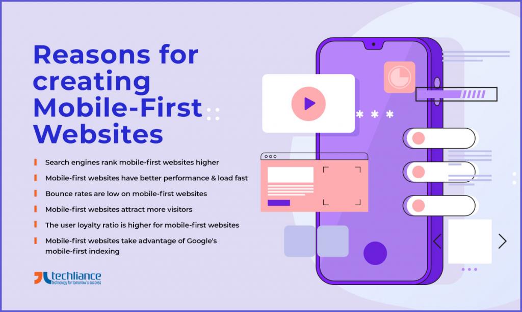
Reasons for creating Mobile-First Websites
More than anything else, though, mobile-first websites are accessible and convenient. All the vital elements – such as calls-to-action, buttons, and texts – are appropriately positioned. Thanks to the consideration that mobile devices have small screens and limited spaces. Some of the prime benefits of mobile-first websites include the following.
- Search engines rank mobile-first websites higher than other sites.
- Mobile-first websites have better performance, optimization, and load fast.
- Bounce rates are low on mobile-first websites.
- Mobile-first websites attract more visitors, so they enjoy a higher number of visits.
- For mobile-first websites, the user loyalty percentage tends to be higher than non-mobile-first websites.
- Mobile-first websites take advantage of Google’s mobile-first indexing rule. This was announced in November 2016, and the first rollout happened in March 2018.
What is Responsive Design?
In May 2010, Ethan Marcotte wrote an article called “Responsive Web Design”. This was inspired in part by the book “A Dao of Web Design” by John Allsop. Marcotte was also encouraged by the ideas he discovered in the book Interactive Architecture. He devised the term “responsive web design” to pertain to the fluid grid and flexible images, among other concepts.
Responsive design is all about creating products and websites that are convenient and easy to view. Even when using different types of devices (and screen sizes). Moreover, responsive websites or products have only a single URL and system. The layouts are flexible, which means they will automatically adjust depending on the user’s device screen size.
In other words, the content, layout, and design of the site will change according to the device’s browser width. So, all the components look the same regardless of the size and type of screen. Also, as such designs use only one URL; there is no need to create separate websites for different users. The responsive website is flexible and is therefore ideal for desktop/PC, laptop, tablet, and mobile device users.
It’s easy to tell if a page or site is responsive. All anybody has to do is go to the browser window and zoom in and out manually. If the design is responsive, zoomed-in elements will appear clearly. If the site is unresponsive, the zoomed-in features will be out of sync and blurry.
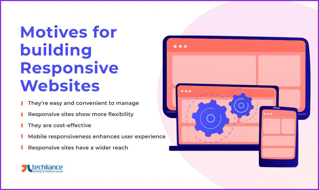
Motives for building Responsive Websites
Some of the benefits that responsive websites provide include the following.
- They’re easy and convenient to manage. Since responsive websites have just a single URL, there’s no need to worry about managing multiple sites.
- Responsive sites show more flexibility. Putting changes to and improving a single website is more convenient and doable than working on multiple URLs. So, this means it is easy to update a responsive website.
- They are cost-effective. Again, since there’s only one URL, there is no need to spend on additional web design and hosts.
- Responsive websites get better search engine rankings. Google puts a high value on mobile-friendly sites, which is what being responsive is about. A high rank means more visitors, increased leads or potential clients, and higher conversion rates.
- Mobile responsiveness enhances the user experience. Users can easily view websites regardless of what devices they use. Even when they switch from one device to another. If a user changes from desktop to smartphone, horizontal scrolling won’t work – unless the website is responsive and automatically adjusts.
- Responsive sites have a wider reach. Websites with a high Google ranking are easier to find. So, they can reach more audiences from different parts of the world. With a more extensive and more varied reach come better chances of converting leads to customers.

Conclusion
Responsive design and mobile-first design each have advantages and functions. So, this is the first thing you should consider when choosing which approach to go for. Additionally, you should study the benefits and disadvantages of each approach.
Mobile-first websites are extremely popular in 2026. But responsive designs have been around for years – and this is also something you need to consider. It is vital to know choosing the most popular in the market is not always the proper thing to do.
Rather, you should first determine your goal for creating the website and who your target audience is. Are your current customers using smartphones? Do they prefer desktops and laptops? What about your potential clients? What are their online behaviors?
Instead of focusing on which approach is getting more attention, pay attention to your audience. Because they are who you need to help you fulfill your goals. Chances are you may want more tips or details on choosing between responsive design and mobile-first design. Then, talk to a professional website developer and designer.
Do you want to craft a mobile responsive website? Connect with Techliance to help you in making this reality. Our expert designers and developers have your back from conception to deployment.
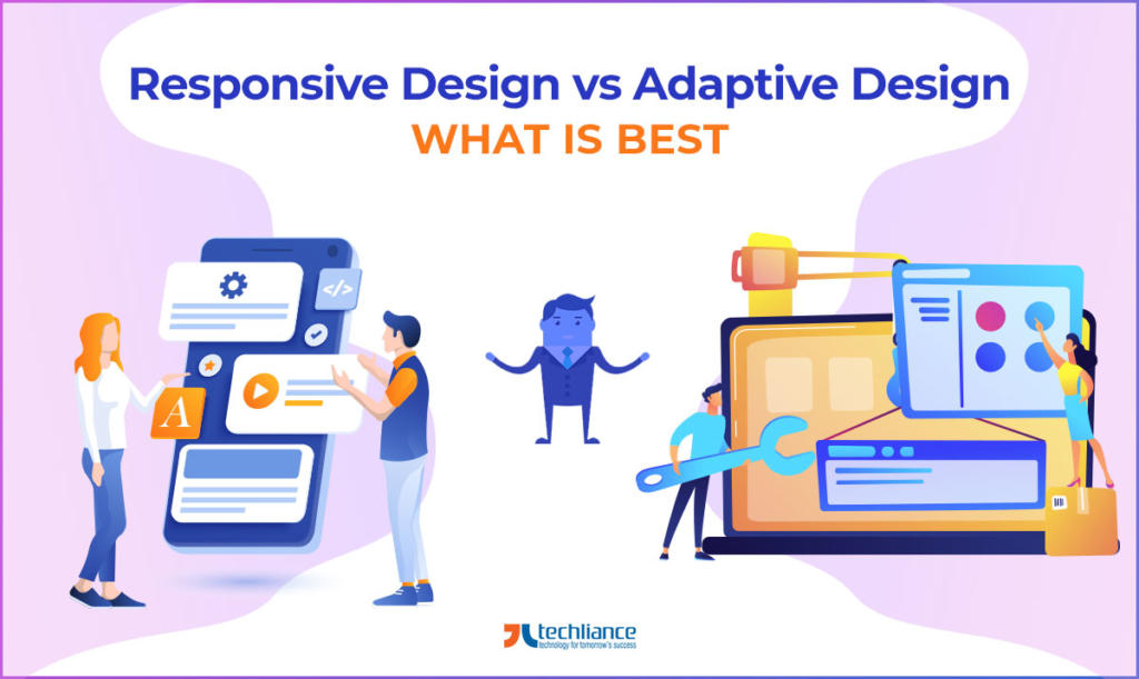
Further Reading: Responsive Design vs Adaptive Design


[…] more people using mobile phones to access the internet, making your website mobile-responsive is more crucial than ever. Presently, it’s essential to improve customer experience on […]
[…] your eCommerce website keeping in focus the accessibility and responsiveness of multiple gadgets. A responsive website makes your online store accessible and responsive on all devices and all screen […]
[…] of your website. To achieve this, implement the most searched keywords, enhance loading speed, and make the website responsive to smaller […]
[…] remain accessible and available to their customers from anywhere and everywhere. So, your website must adjust to any device they use, especially mobile phones and […]
[…] Battle time: Mobile-first Design vs Responsive Design […]
[…] ASP.NET does not support mobile app development. But it can noticeably enable the development of mobile-responsive websites. This is a great thing for businesses to create websites that are easily viewable on tablets and […]
[…] of customers are likely to start visiting your website. Consistent with the new Google algorithm, mobile-centric websites achieve a higher ranking in the search engine. When your website has good ranking positions, your […]
[…] the example of eCommerce platforms that showcase and sell products online. They work brilliantly irrespective of any screen: PC/laptop, mobile, or […]